Le Veneziane
Goal
Redesign the packaging to optimize the user experience and make the pack feel “premium”.
The current box doesn't close
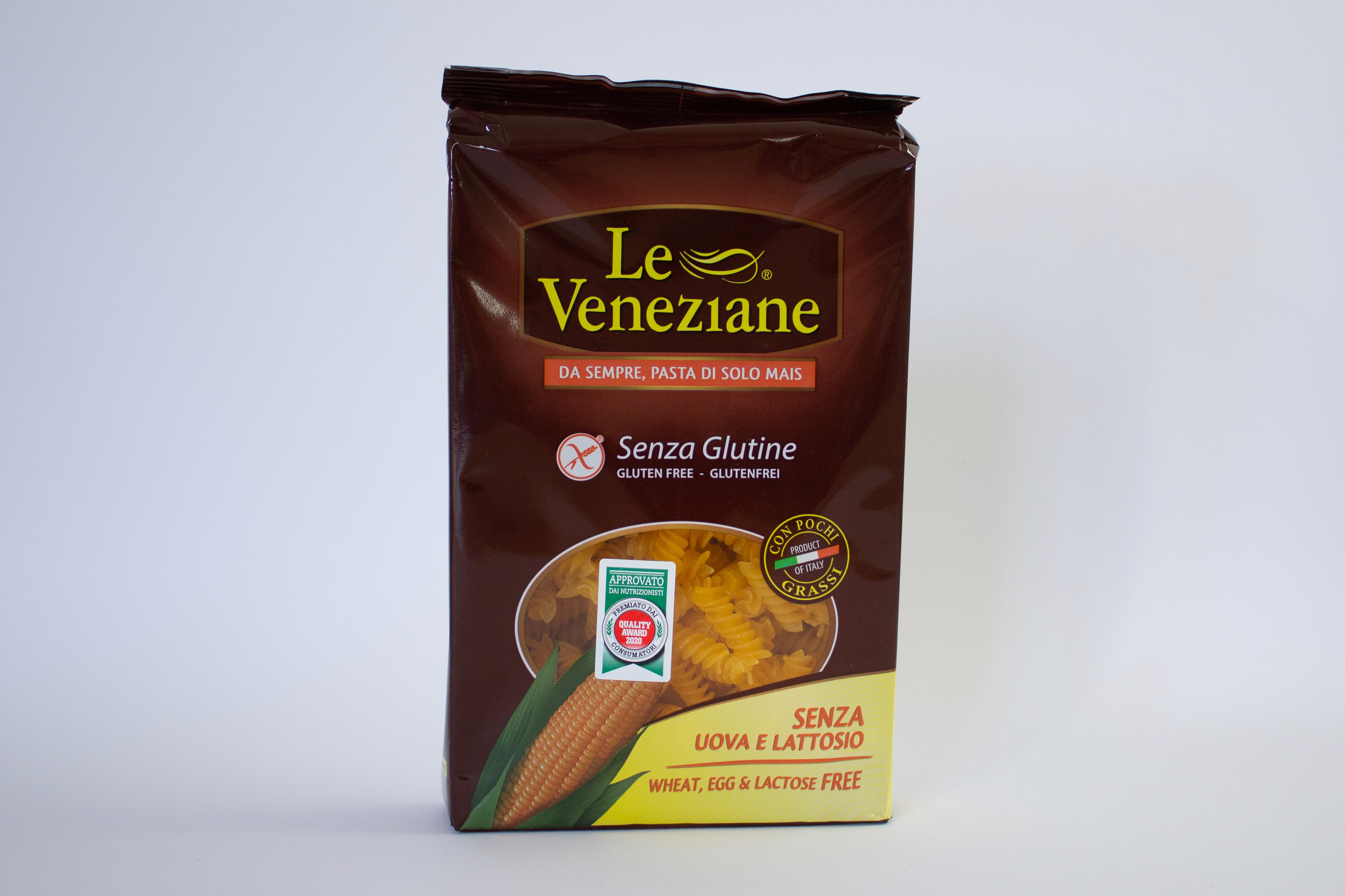
The pasta is contained in a cardboard box, which is in turn wrapped in a plastic sleeve. This packaging shape doesn’t provide the right affordance: going by the graphics, it should stand vertically, but because of its shape it always ends up lying horizontally on shelves. The packaging is hard to use: after it’s opened once, the plastic sleeve can no longer be reclosed, so the product has to be stored in another container.
Functionality, not just asthetics
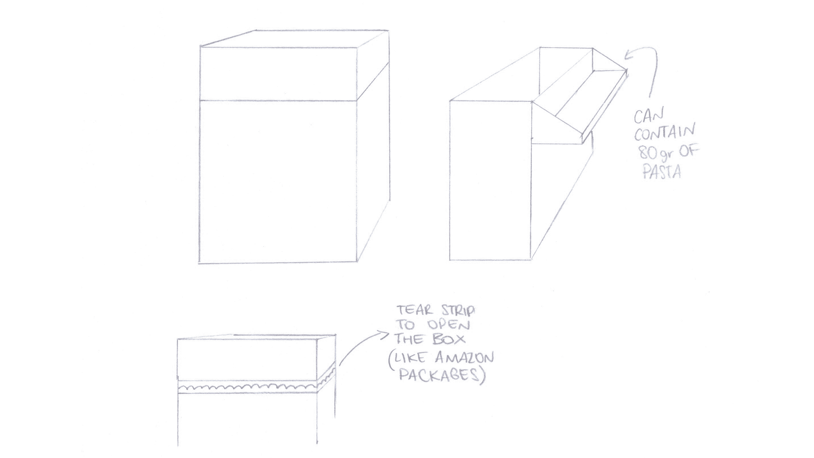
I wanted to give people the ability to close the pack, as well as to weigh the pasta without needing any extra tools. The lid could be used as a “measuring cup” for portions.
Initially, the lid was designed to stay attached to the rest of the pack, like cigarette packs or chewing-gum packs. With this design, however, when pouring the pasta into the water the user would also have dropped the pasta left in the pack, in addition to what was held in the top part.
How did I solve the problem
I simplified everything by designing a lid that’s independent from the box, to be used as a plate: pouring the amount of pasta needed directly into it and emptying only that into the pot of water.

A more premium pack
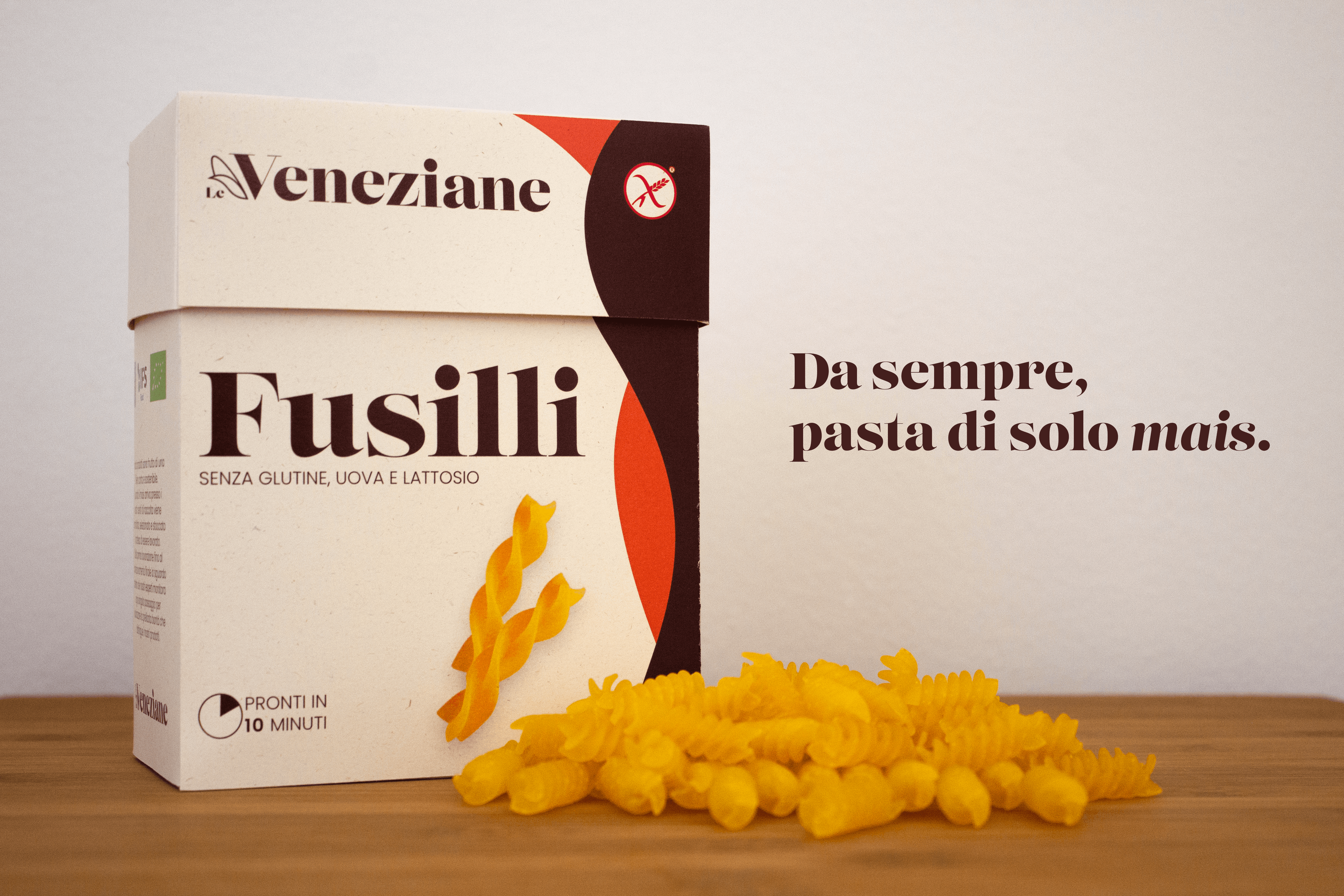
The redesigned packaging keeps the colors of the previous one. It’s based on a paper with a birch-bark texture, to highlight the craftsmanship and quality of the product. As a nod to Venice, from which the company takes its name, the pack includes colored waves that emphasize the hierarchy. The typography pairs serif fonts, to evoke elegance and quality, with sans-serif fonts that make it easier to read.