Client:
Personal project
The goal
Improve the existing user experience of the booking section in the water park's website.
The problem
The current version of the website presents all the steps for booking tickets on a single page, one after the other. There are a few factors that require attention:
The section titles are visually similar to the call-to-action button, which makes it unclear whether the user can click on all the items or just the last button.
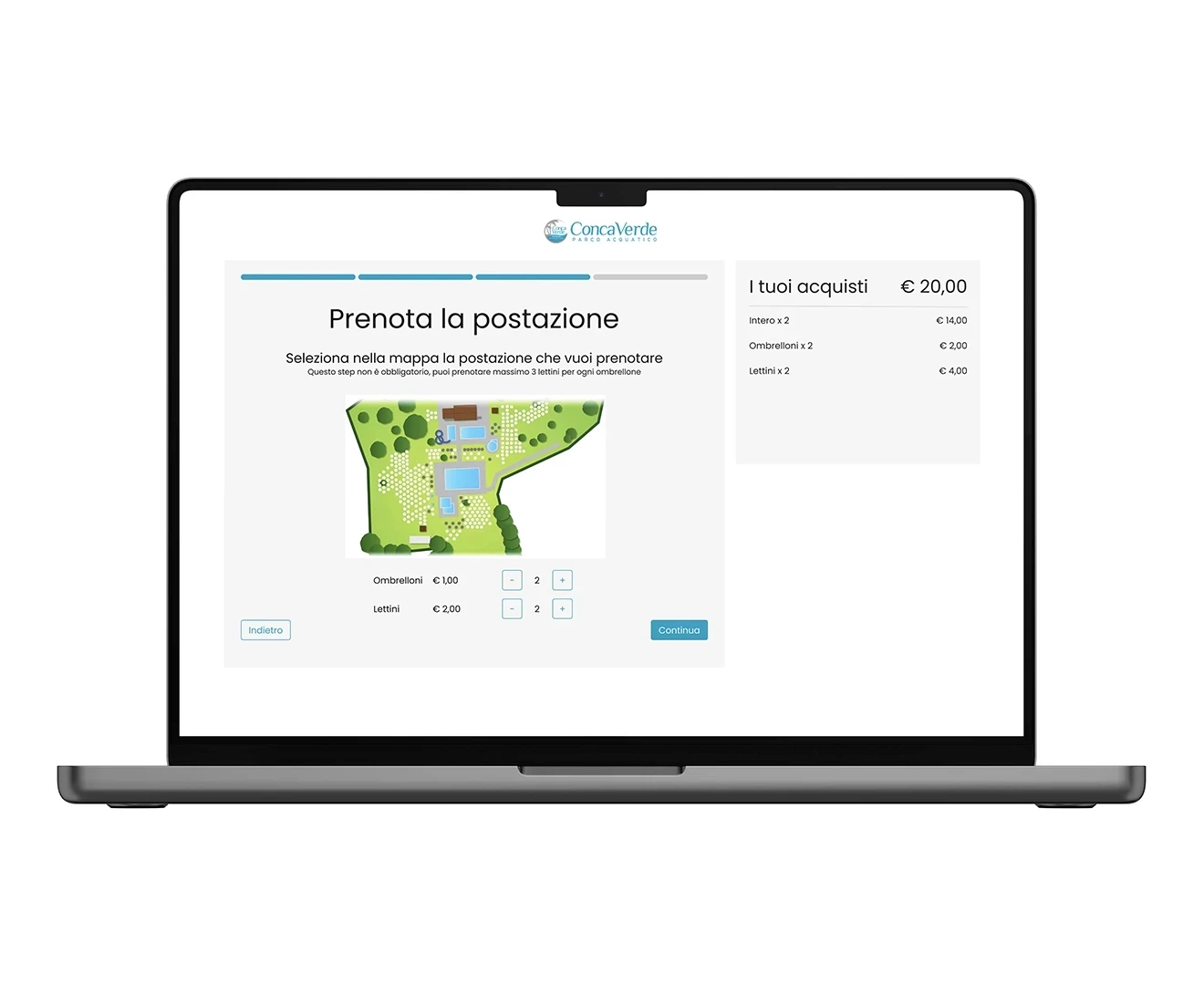
The total order cost is not visible until the very last step, which means that the user has no feedback on what they are booking until then.
The map is not resizable, which makes it difficult for users to select spots in the garden from their smartphones or other devices.
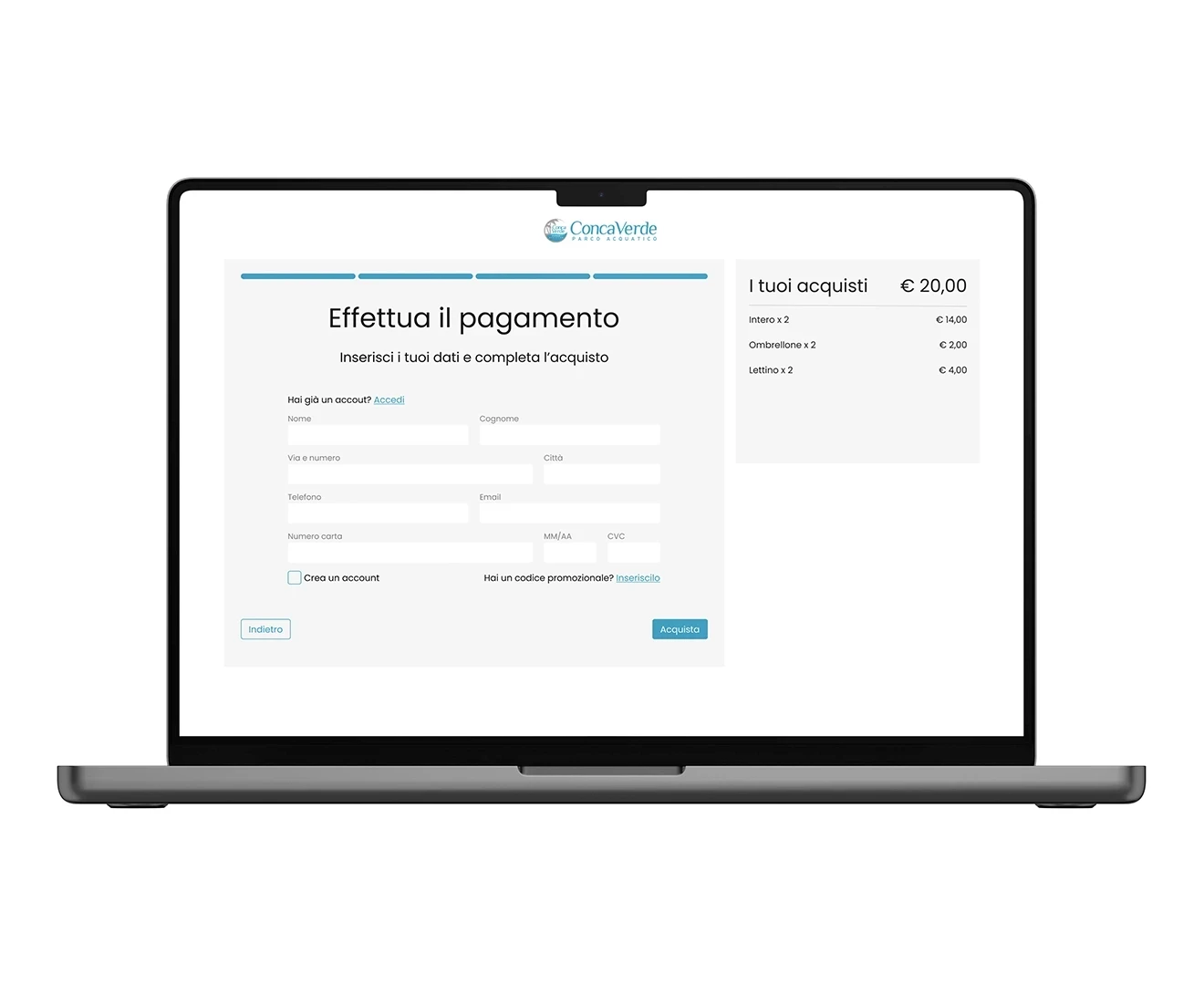
Moreover, the UI of the checkout is not coherent with the previous section.


The solution
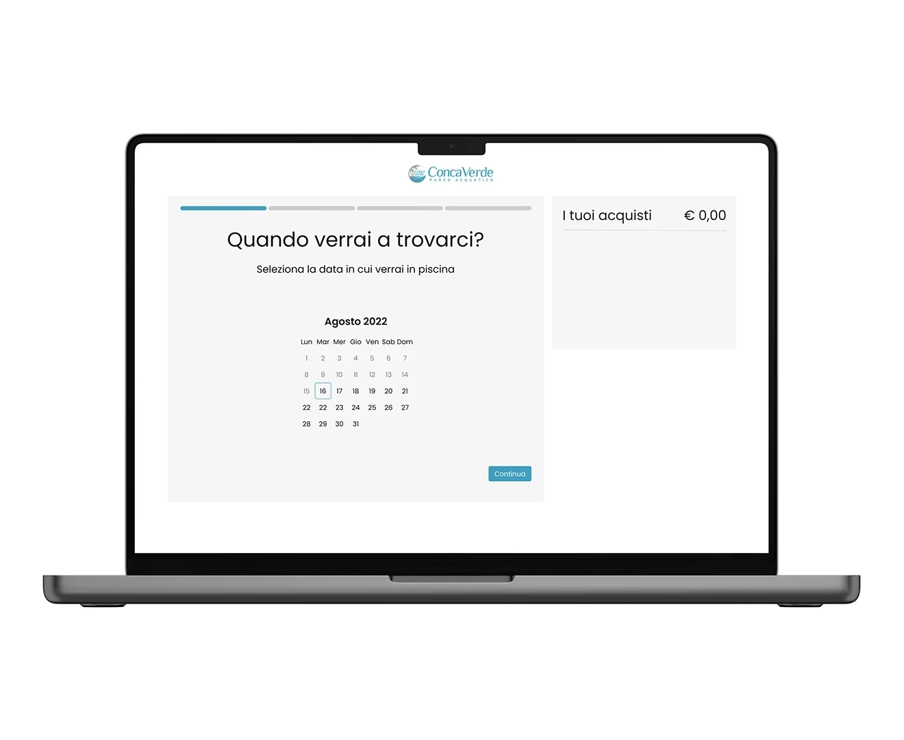
I have divided the process into four steps to clearly outline the main action for each one. The instructions are organized according to the reference steps. Once the date is selected, the user is prompted to book tickets, followed by reserving a spot in the garden (which is optional). Users can navigate back and forth in the flow, and the progress bar displays how much is left until the end of the process. A subtotal for all steps can be viewed in the box on the right-hand side of the screen.